Visualization with Paraview - Networks generated with the GA-RFB-electrode tool
To obtain a visual representation of the networks generated with the GA-RFB-electrode tool, the following procedure can be followed.
The first step is running the ‘GA_to_VTK_and_properties_Windows’ script, generating the following output files:
• /output/GA/… folder with the polarization curve data, throat and pore information for the distinct layers (in case of a cubic network), and .vtp files with the anodic and cathodic networks with and without surface pores.
• /output/GA/…_psd.xlsx file with the pore size distribution data of the network.
• /output/GA/…_velocity.vtp file with the absolute velocity and flowrate saved.
To obtain the pore size, concentration, absolute velocity, and hydraulic conductance visualizations, the /output/GA/…_velocity.vtp files can be used and loaded into Paraview.
Settings for the pore diameter visualization
To obtain the .png figures, the following procedure can be followed:
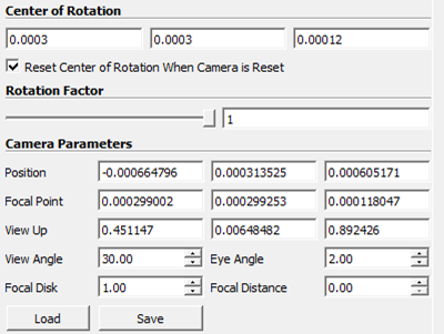
• Adjust camera:
The settings that were used for the visualization of the cubic network are shown below:

TIP: use Paraview to analyze the boundaries of the network (inlet, outlet, current collector, and membrane with left, right, bottom etc.), which can be checked easily with a preset camera orientation.
• Throat visualization:
After applying the loaded …_velocity.vtp file, the ‘Coloring’ can be changed to for example ‘Solid Color’ with (R, G, B) (150, 150, 150) which was used for the cubic networks, or (200, 200, 200) which was used for the extracted networks.
The throat visualization was further changed by changing the Opacity (for example to 0.5) and the Line Width (‘Toggle advanced properties’ wheel in ‘Properties’, set for example to 2).
• Pore visualization:
Apply the ‘Glyph’ filter to the .vtp file. Change the properties of the ‘Glyph’ filter to:
o Glyph Type: Sphere
o Orientation Array: No orientation array
o Scale Array: network | net_01 | properties | pore.diameter
o Scale Factor: 1
o Glyph Mode: All Points
After applying, change the ‘Coloring’ to network | net_01 | properties | pore.diameter. In the ‘Color Map Editor’ change the ‘Mapping Data’ by pressing the folder with the hearth (‘Choose Preset’) to apply the ‘Viridis (matplotlib)’ as color scale. Then change the ‘Set Range’ (second button in ‘Mapping Data’) from 0 – 40e-6. This diameter scale should change depending on your pore diameters of the analyzed network. Moreover, the scale bar can be adjusted with the ‘Edit Color Legend Properties’.
• Exporting the figures:
Press the ‘Capture screenshot to the clipboard…’ (third symbol in the Layout screen) and go to File/Save Screenshot…. Save the screenshot and change the options to a ‘Transparent Background’.
Settings for the pore concentration visualization
For the concentration figures, the same procedure can be used as described for the pore diameter, but with different settings in the ‘Glyph’ filter. The ‘Coloring’ should be changed to ‘network | net_01 | properties | pore.concentration’ and the ‘Color Map Editor’ should have a different ‘Set Range’ (for example 95 – 100) and the ‘Choose Preset’ can be changed to for example the ‘Concentration’ color scale that is saved under the Image processing folder in GitHub.
Settings for the absolute velocity visualization
To obtain the absolute velocity plots, a different procedure must be followed as the actual throat sizes must be visualized. To this end several filters must be applied in the following order:
• Shrink, with a ‘Shrink Factor’ of 1.
• Cell Data to Point Data
• Extract Surface
• Tube, with:
o Scalars: network | net_01 | properties | throat.diameter
o Capping on
o Radius: 1e-6
o Vary Radius: By Scalar
After applying, the ‘Coloring’ can be changed to phase | catholyte | properties | throat.absolute_velocity. In the ‘Color Map Editor’ change the ‘Mapping Data’ in ‘Choose Preset’ to for example the ‘Absolute_velocity’ color scale that is saved under the Image processing folder in GitHub. Then change the ‘Set Range’ from 0 to 0.1 for example.
Settings for the throat hydraulic conductance visualization
For the hydraulic conductance figures, the same procedure can be used as described for the absolute velocity, but with different settings in the ‘Tube’ filter. The ‘Scalars’ and ‘Coloring’ should be changed to ‘phase | catholyte | properties | throat.hydraulic_conductance’ and the ‘Color Map Editor’ should have a different ‘Set Range’ (for example 1e-20 – 1e-12) and the ‘Choose Preset’ can be changed to for example the ‘Black-Body Radiation’ color scale which can then be inverted using the ‘Invert the transfer functions’ button (fifth button in ‘Mapping Data’).